

Multi Charts
One of the most frustrating aspects of charting relates to plotting multi-dimensional and/or multi-measure data in a single chart. To facilitate this issue, users typically plot data in two or more separate charts. However, it is generally an ineffective approach because the query is dynamically executed, with a varying number of data points.
Automated multi-charting is designed to solve this problem. And when combined with combo-charting, the dynamic charting capabilities become both powerful and empowering.
Multi-Charting Logic
- Multi charts are created for each series in the query. Since the "column" of the result set is used to generate the series in charts within the Pyramid application, multi charts are created for each element within the FIRST dimension of the columns.
- If there are two dimensions on the columns, the first column is used to denote the separate charts in the multi-chart set, while the second is used to build the normal chart series for each chart.
- If there are more than two dimensions on the columns of the result set, the first is used to generate multi charts, while the remainder are combined and used to create the chart series as in a normal single chart.
As usual, result set "rows" are used to generate the chart categories for each chart.
Multi-chart Heuristics and Auto-Trellising
The charting engine has a few automated layout options that can be triggered based on query heuristics:
Auto-layout (blue highlight below):
This engine automatically choose between single and multi charts as well as the relevant layout.
- If the user puts 2 measures on the columns of a query, the multi chart engine is automatically engaged.
- If there are 2 or more hierarchies used on the columns of the query, the multi chart engine is automatically engaged.
- Auto-trellising (optimized layout of multiple charts) is turned on.
Auto Trellising (red highlight below)
This engine optimizes the layout of the charts on screen based on the number of charts and the available screen real estate
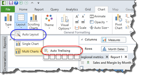
NOTE: Auto-layout can be turned off or on as the default from user options on the Account page.
Turning on Multi-Charting
- In the Chart Tab, click the Layout button (second from the left). In the drop down table, select multi-charts. Then hover over the grid selector to choose the multi-grid layout you prefer. The engine will automatically array the charts on screen in the format you have chosen.
- If the number of charts exceeds your selection, the engine will continue to wrap the charts on screen. Alternatively, use the Auto trellising option for optimized layout.
- To go back to a single chart, use the same button and choose single charts.
NOTE: Multi charts are automatically assigned the title of the corresponding column value. This can be customized in the Multi-Chart title label dialogs, but the title itself cannot be changed.
Multi-chart Examples
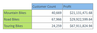
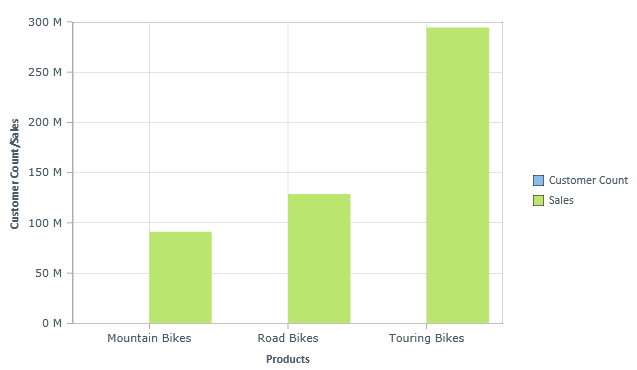
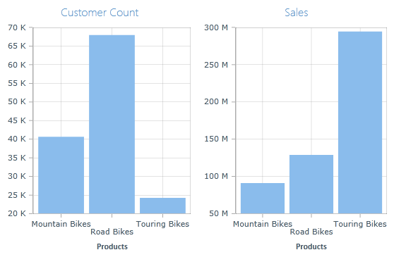
1. Multiple Measures: using the simple tabular result set below, compare the first standard single chart to the second multi chart of the same query below. The disparity makes the customer count measure useless in the first chart, while the two-click multi-chart makes the analysis useful and insightful.
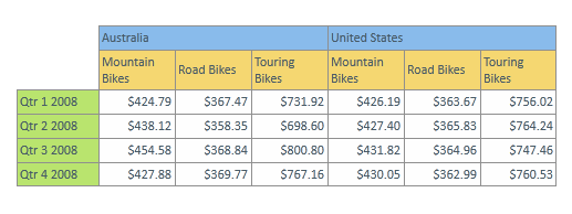
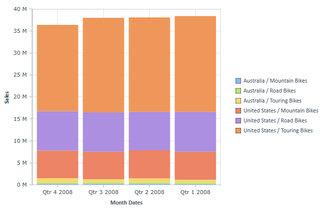
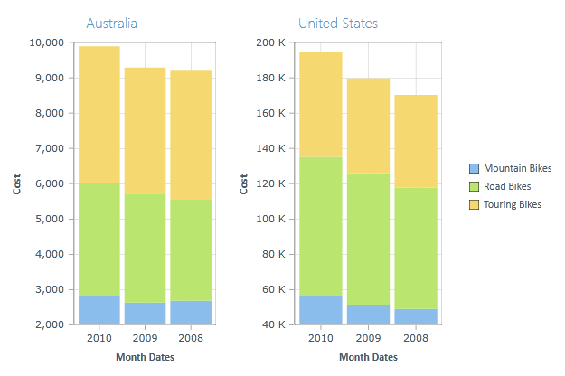
2. Multiple Dimensions: using the more complex, multi-dimensional tabular result below, compare the first standard single chart with two "column" dimensions to the second multi chart. Being able to use multi charts simplifies the analysis of the products sales between countries by calendar year.
NOTE: The charting engine will DYNAMICALLY produce the right number of multi charts depending on the number of visible elements in the result set.
Home |
Table of Contents |
Index |
User Community
Pyramid Analytics © 2011-2022